First draft of the new cover

The sequel is progressing – the text is currently undergoing review (by three separate editors!), I have completed the introduction and acknowledgements (my word what a lot of help I have had) and, here is the first draft of the new cover:

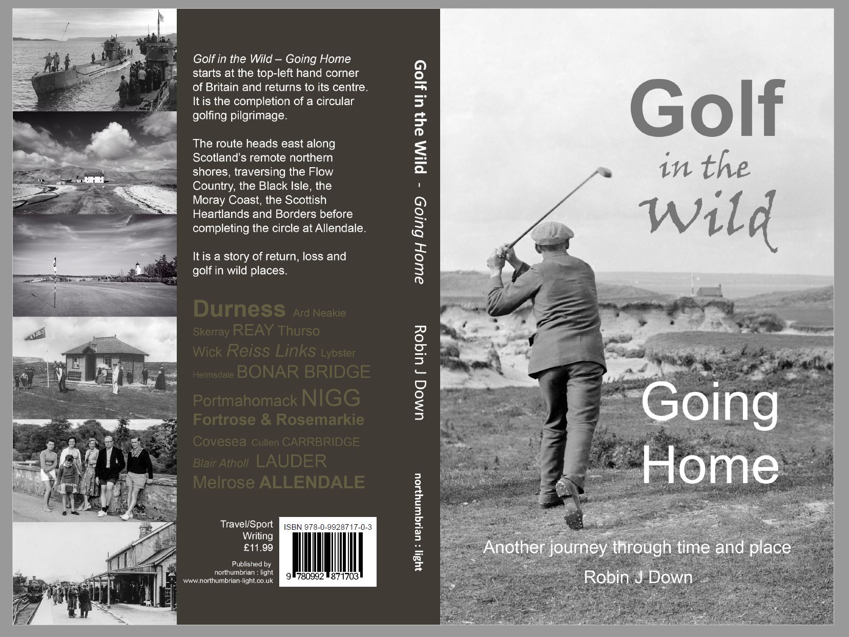
The eagle-eyed might notice a ‘slight’ price increases and the fact that the ISBN is the same as book 1. Some things might change before publication 😉  As an aside – in the 21st Century we are brainwashed by advertising.  I keep seeing the Costa coffee sign on one of the back cover images!

The inside cover

Publication date moves ever closer.  The final edits have been applied and now I await a digital proof before going to press.  A late decision was inclusion of an inside cover image with descriptive text to add interest to the opening page. This has also provided space for a generous review from my good friend Norman Harris of The Times:

Small is clearly beautiful to the author, and so is remote.  He has a passion and curiosity for these special golfing terrains and the way local landscapes and history have shaped them. His odyssey should strike a chord with a small army of kindred souls.”
Norman Harris – THE TIMES

The Cover

This is the latest version of the cover – there have been seven previous versions. The various iterations have all revolved around the text on the front page – the font type, size and positioning. There has even been a version with vertical text to compliment the flag stick – I was rightly persuaded to drop that idea.  If this is final, publication just now awaits a final round of professional editing.